Founded in 1967 out of the civil rights movement, CHAPA (Citizens’ Housing and Planning Association) has long championed the belief that every person in Massachusetts deserves a safe, healthy, and affordable place to call home. Today, the organization brings together policymakers, developers, lenders, municipalities, community groups, and tenants to build consensus and advance solutions to the state’s most pressing housing challenges.
As CHAPA’s influence grew, its visual identity no longer reflected the organization’s reach, sophistication, or impact. Minelli partnered with CHAPA to create a contemporary brand that amplifies its mission, strengthens recognition, and positions it as both a connector and a catalyst for housing progress.
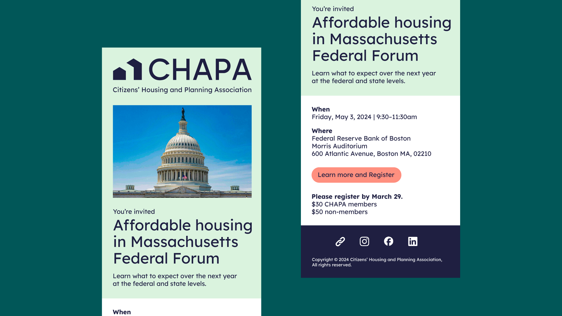
The new brand was informed by extensive research, including interviews, surveys, and stakeholder analysis. The findings revealed a need to shift from complex, text-heavy communication toward a clearer and more human-centered voice. The resulting identity emphasizes clarity, warmth, and confidence, enabling CHAPA to communicate not only what it does, but why its work matters.
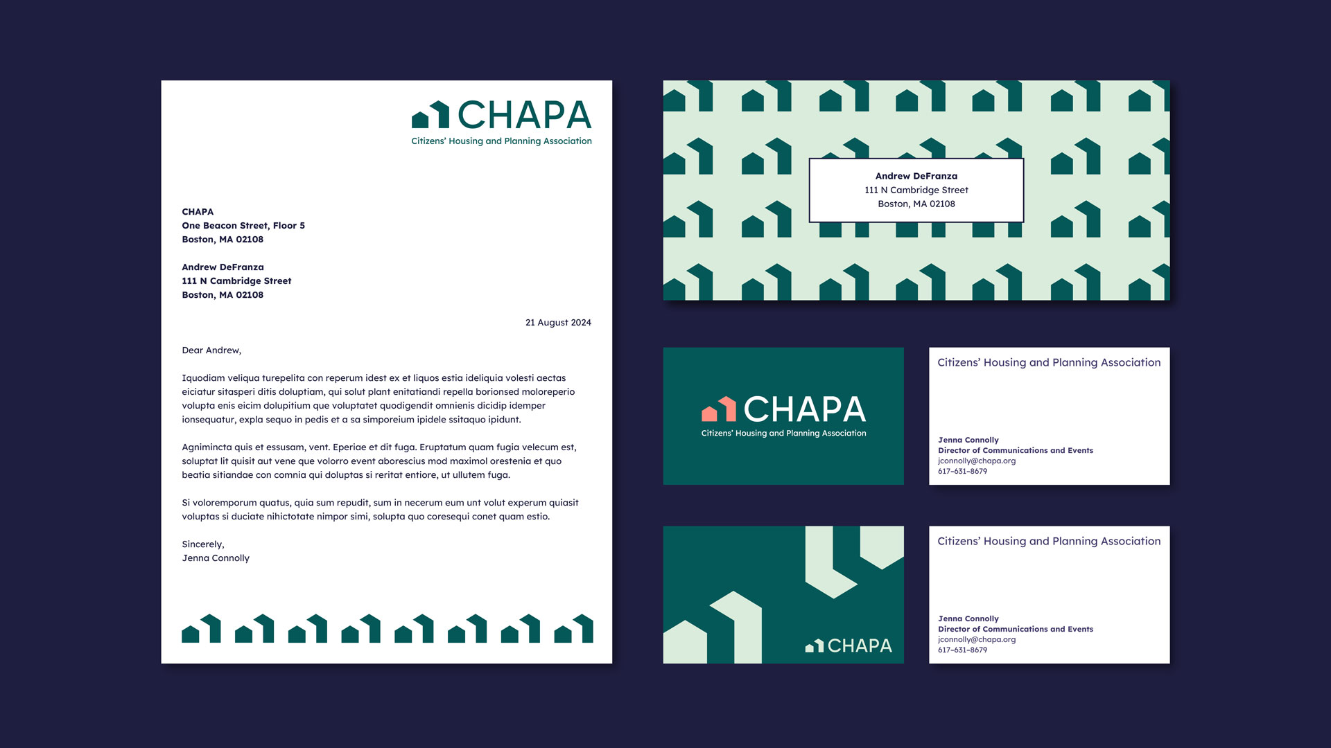
The new logo mark symbolizes both a house and an upward-pointing arrow, representing growth, stability, and forward momentum. A vibrant color palette—led by CHAPA Green and complemented by Midnight Blue, Honeydew, and Coral—brings warmth and optimism to the brand. The ultra-legible Lexend typeface ensures accessibility and consistency across all materials, while the confident, modern voice reinforces CHAPA’s leadership in the field.
Together, these elements form a cohesive identity that embodies CHAPA’s enduring values of equity and access while energizing its communications for the future. The refreshed brand reflects an organization that continues to build bridges, elevate voices, and advance housing solutions for all.