Part One
Humans are complex. This is fairly evident for anyone who has ever been in a serious relationship, worked collaboratively in a team, or parented a child. Did I mention that parenting a child is a solid illustration of human complexity?
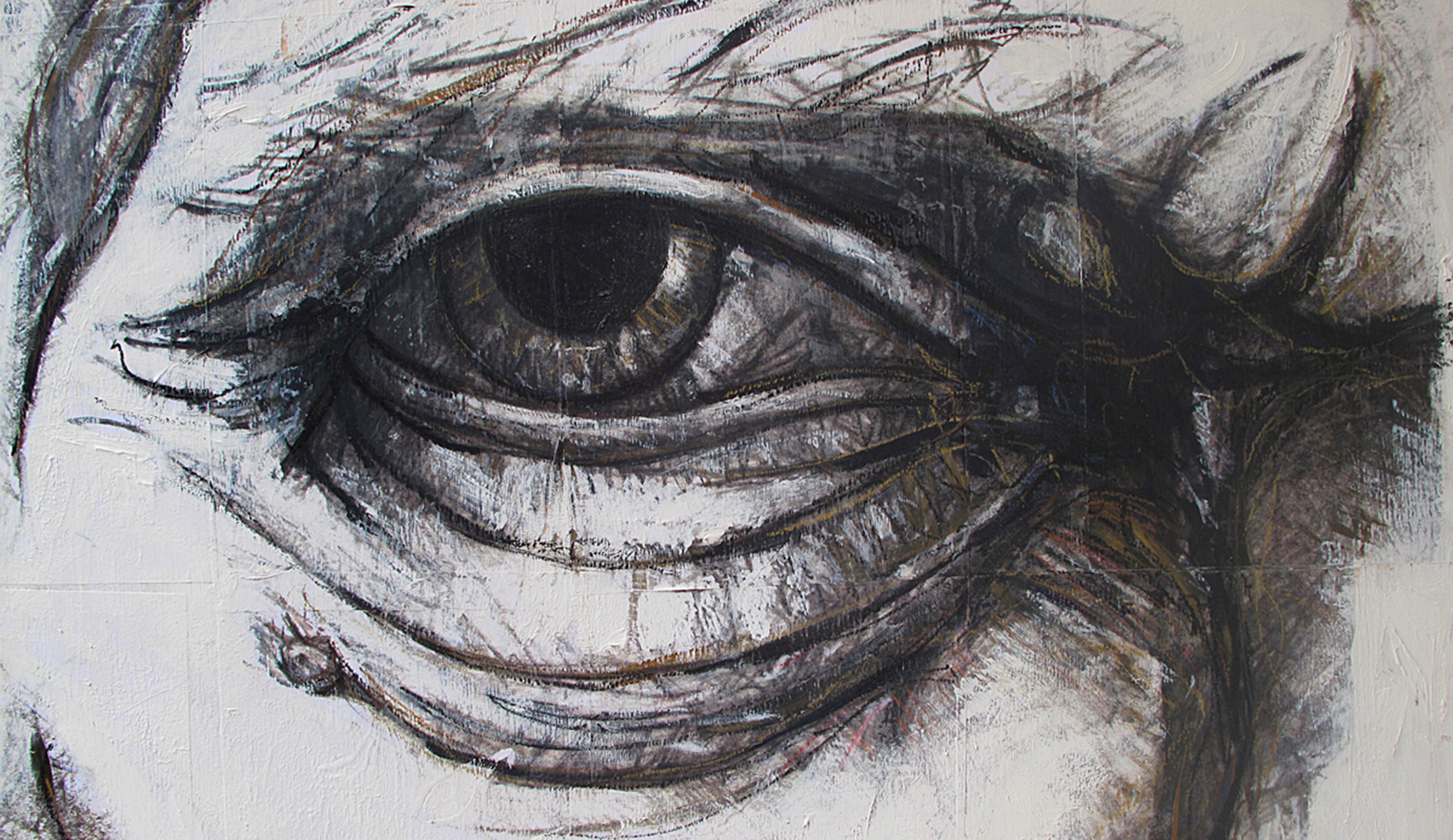
Looking at a single aspect of the way that people actually function…how we see…turns out to be remarkably complex too. Not only does the sense of sight require immense physiological resources, but it is also influenced by a host of other factors, whether they be culturally-based or rooted in the mechanics of how we process visual information. Explorations into perception are endlessly fascinating, and there are plenty of good insights into the subject…some covered in doctorial research papers and others (equally compelling) in old children’s books about optical illusions. Here at Minelli, our work relies on our ability to help guide the way that people see and to influence these very perceptions.
Interstate is a font and a highway
Let’s start with simple visual cues that are encountered by the average person hundreds, if not thousands, of times every day. These cues are collectively known as type. Type is everywhere. After all, it makes up the central component of reading. At the office, of course, we adore the stuff and revel in its history, meaning, form, and amazing expressive power. By contrast, the average person-on-the-street tends to be less enamored with type, which is simply not a burning topic at sports bars or (most) dinner parties.
But despite the average person’s indifference to the subtleties of typefaces, she or he has incredibly specific, though probably not conscious, expectations about what particular letterforms convey, depending on usage. We expect one kind of font when we are reading a newspaper, another when we read a wedding invitation, and yet another when peering at a highway sign.
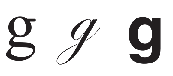
Things get really interesting when we start to mess with these ingrained expectations. Cursive-style font on the homepage of the nytimes.com? Slim and gentle serifs along the roadside? Chunky, blocky type on the menu at Chez Vous?
Now, the average person may not be able to articulate why she or he feels uncomfortable, but explicitly challenging agreed upon typeface usage can really make a person’s skin crawl. Alain de Bouton references a similar phenomenon in The Architecture of Happiness, describing people’s reactions to miscues in the built environment, “We don’t generally experience chronic pain when the fine-grained features of design have been ignored, we are simply forced to work harder to overcome confusion and eddies of unease.”
Seeing is not a passive reflex
What we “see” is not the pattern that actually passes across our retina, but rather, our interpretation of it. And these interpretations are not assured, constant, or stable. Consider our experience with color.
The amazing color studies in Josef Alber’s landmark book The Interaction of Color, beautifully convey the relative nature of color. The book was originally developed as a teaching aid for artists and teachers, but the revelatory content is now a standard part of almost every design curriculum. Below is just one example taken from Alber’s book.
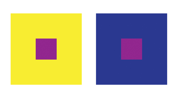
The purple in each square is made up of identical RGB formulas. They are exactly alike, even though most of us perceive them as quite different. Most of us simply cannot see the two purples as the same because the colors exist exclusively in relationship to their backgrounds.
The fact is, colors do not actually exist. Wavelengths of light are not indigo, crimson or azure; the sky is not blue. We just perceive it that way. Or, for a more metaphysical way to think about it, recall the famous line from The Matrix: “Do not try to bend the spoon, that’s impossible. Instead only try to realize the truth… there is no spoon.”
Part Two
Please step forward
In order to process visual information, whether they be letterforms or colors, we need to imbue the random information that constantly hits our visual cortex with a sense of order and structure. That’s what our process of perception provides.
Without the organizing process of perception we would not see objects, space, events, people or relationships but would drift through a world of meaningless, random sensations.
–Psychology and Life, Glenview IL, 1988
Without perception, we are drinking from a visual fire hose. Without perception, it gets real tough just walking through a doorway, pouring water in a glass, or stepping off a curb. Optical illusions and much of the work produced by today’s graphic designers rely on a clever re-jiggering of the expected order of things. When done well, they present irreconcilable conflicts that prevent us from determining a set order. Our perceptual process starts screaming, “Enough already!” Below are just a few examples of optical illusions that nicely capture the power of perception. Equally remarkable is our perceptual ability to assemble a limited number of visual cues into a pattern of meaning. Even when given precious little information, we can cross-reference what we do know to fill in the blanks
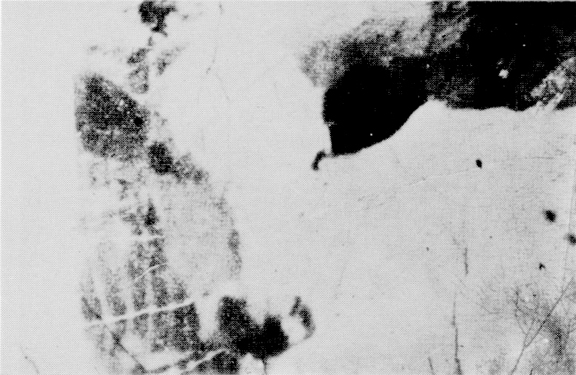
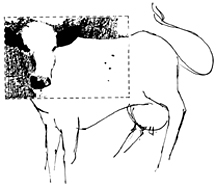
The famous Dallenbach image from the 50’s demonstrates the power of perception perfectly. The image presents us with a stark monochromatic picture that has been stripped of the critical cues to establish foreground and background. It may be interesting in the abstract but the patterns just don’t connect to form a literal image. What’s really fascinating is that once the cues have been fully established, it is very difficult to not see our bovine friend in the original image when we revisit it, whether today or a year from now. Once something has been “seen” it is almost impossible to “unsee” it.
Part Three
A rose by any other name
We humans are needful creatures. Order, itself, really isn’t enough for us. We also need to assign meaning to the things that we see. This need is vividly conveyed in an exercise about visual metaphors that was developed by Dr. Angela Dumas in the UK, and revisited in @issue magazine. In the study, participants were presented with paintings created by three modern masters, Picasso (A), Mondrian (B), and Kandinsky (C). (images needed?)
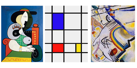
Instead of asking the study’s participants to comment on the formal composition of the paintings or speculate about the artist’s intent, they were given a series of unrelated questions about mapping meaning to the paintings. The responses? Utterly remarkable. The participants were perfectly happy to assign both meaning and personality to the images…meaning and personality that almost certainly lie far outside the artists’ original intent.
Below are just a few of these puzzlers.
- Imagine each painting represents an airline, which would you choose?
Mondrian (B) is the very clear winner here. To paraphrase one participant, “Order and efficiency. You don’t need an airline to be creative, you need it to not crash.” Oh, and absolutely no one wants to fly with Kandinsky (C) airline. Apparently, the participants agreed with the late, great George Carlin: “I don’t want to be on a non-stop flight. I want it to land one day.”
- Each of the painting represents a presidential candidate, who would you vote for?
Responses were mixed, but one participant noted, “I will vote for Picasso (A). I like the positions of Kandinsky (C), but they don’t stand a chance of getting elected.”
- Imagine each painting is a company. Which one do you think you would like to work for? (Obviously, this survey was last done when there was a good economy, and companies hired people instead of laying them off.)
Mondrian (B) may run a fine airline, but is apparently going to be no party to work for…check out these paraphrased comments. “Very corporate, no room for breaking out of the box, no new ideas, highly structured…rigid, conservative…strict hierarchy, heavy handed.” Picasso (A) seems like a good choice here. “A lot of room to move and try ideas, but with clear limitations.” We do issue special warnings for young, attractive women planning to launch careers at this corporation.
Seeing is not a passive act. Rather, it is a constructed and proactive one. Our overriding need to create order and meaning out of chaos is perfectly mirrored in the way we shape…and ultimately are shaped… by the process of interpreting the endless amounts of visual stimulation that comes flying at us every day. By nature and nurture, we’re on an eternal quest to establish context and meaning.
For everyone working in fields associated with the visual arts, our thinking and investigation into how we see must be equally proactive. If we wish to be able to positively shape perception, we must have a good sense of how it actually works.