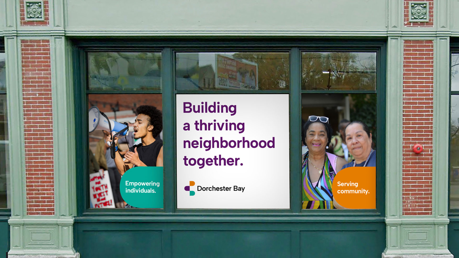
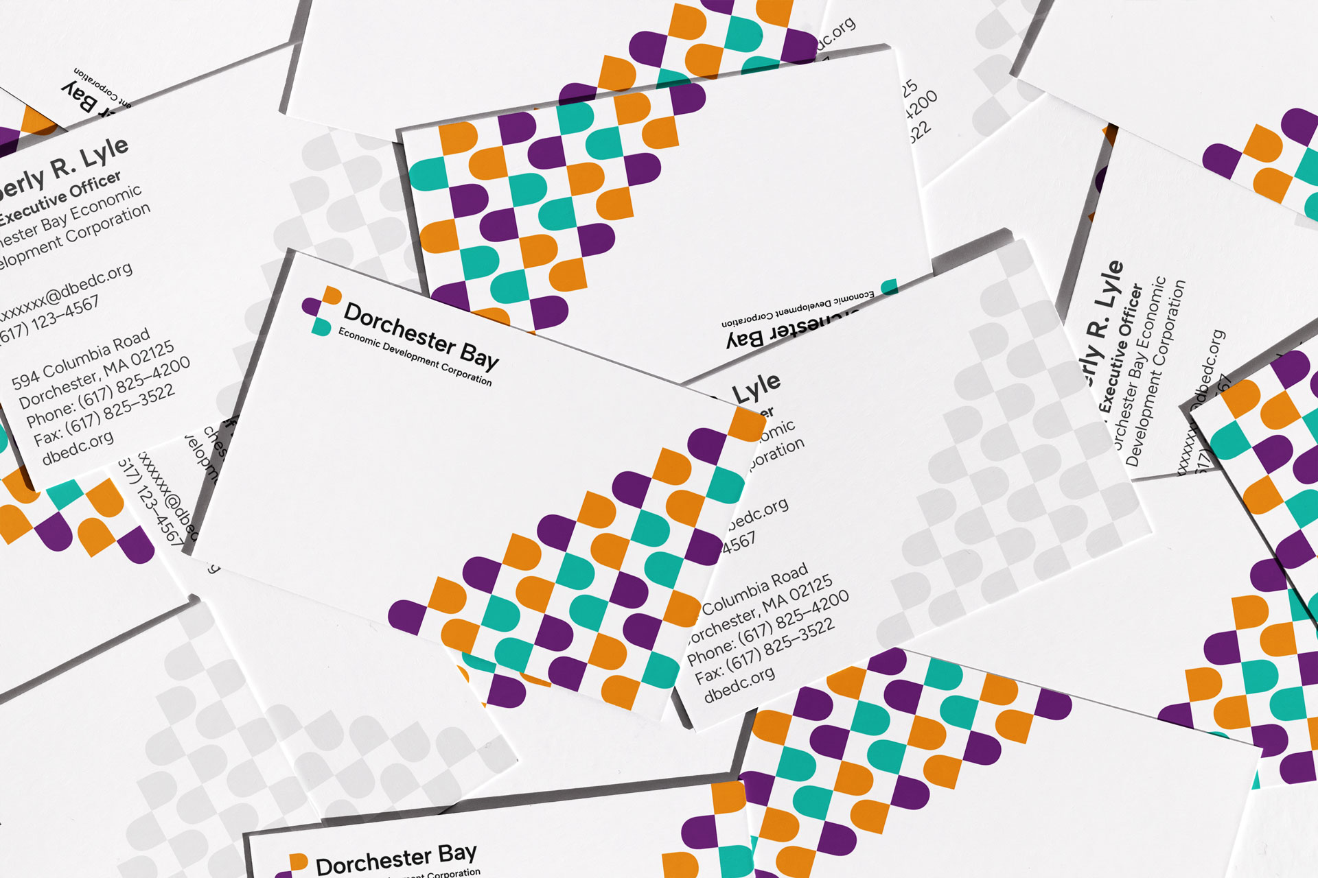
Dorchester Bay Economic Development Corporation works to build a strong, thriving, and diverse community in Boston’s Dorchester neighborhood. Their many initiatives include developing affordable housing, lending to small businesses, and community organizing. Dorchester Bay approached Minelli to build their new visual identity at an important moment. With new leadership and a heightened sense of focus, they were poised to raise awareness in their organization, taking their place as a more visible and passionate force for positive change.
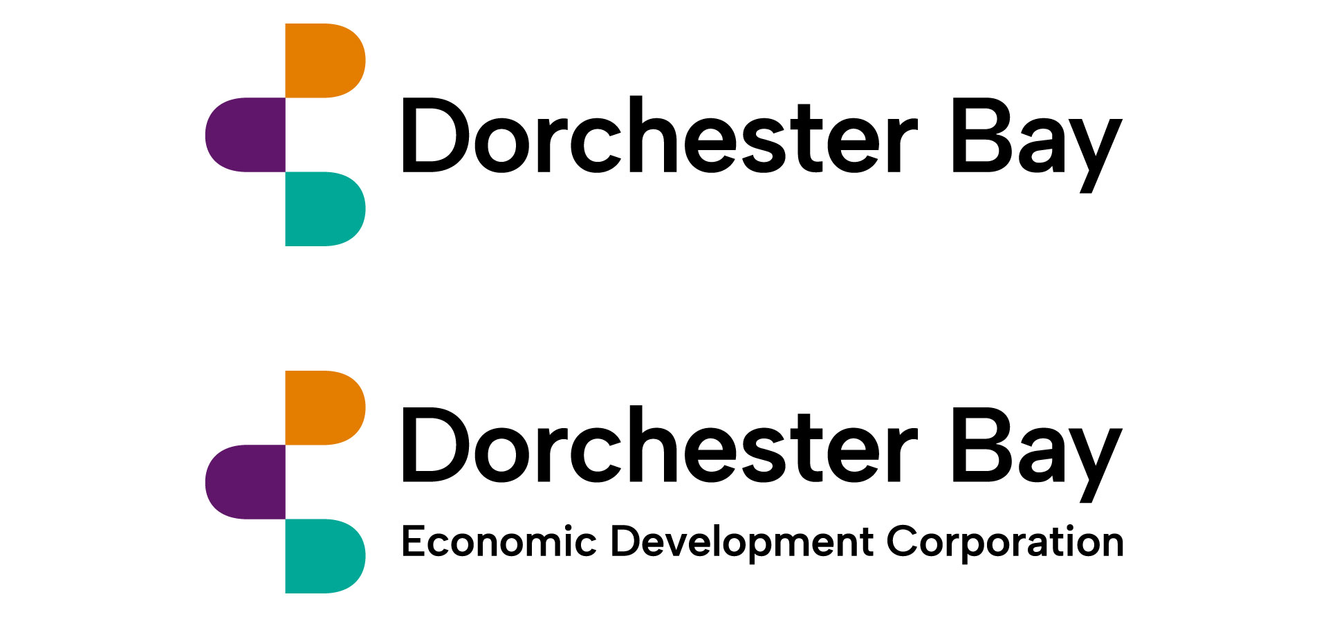
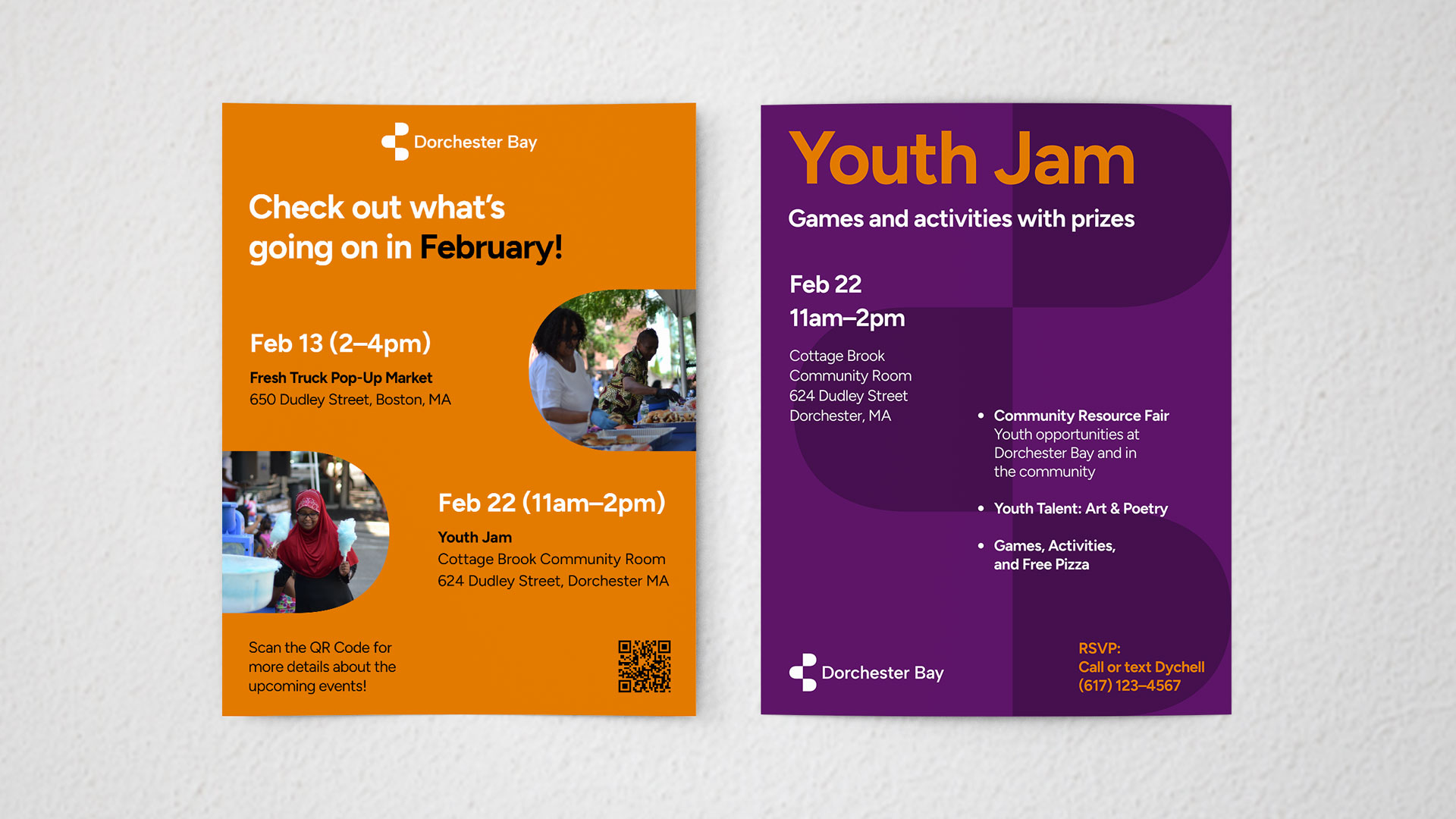
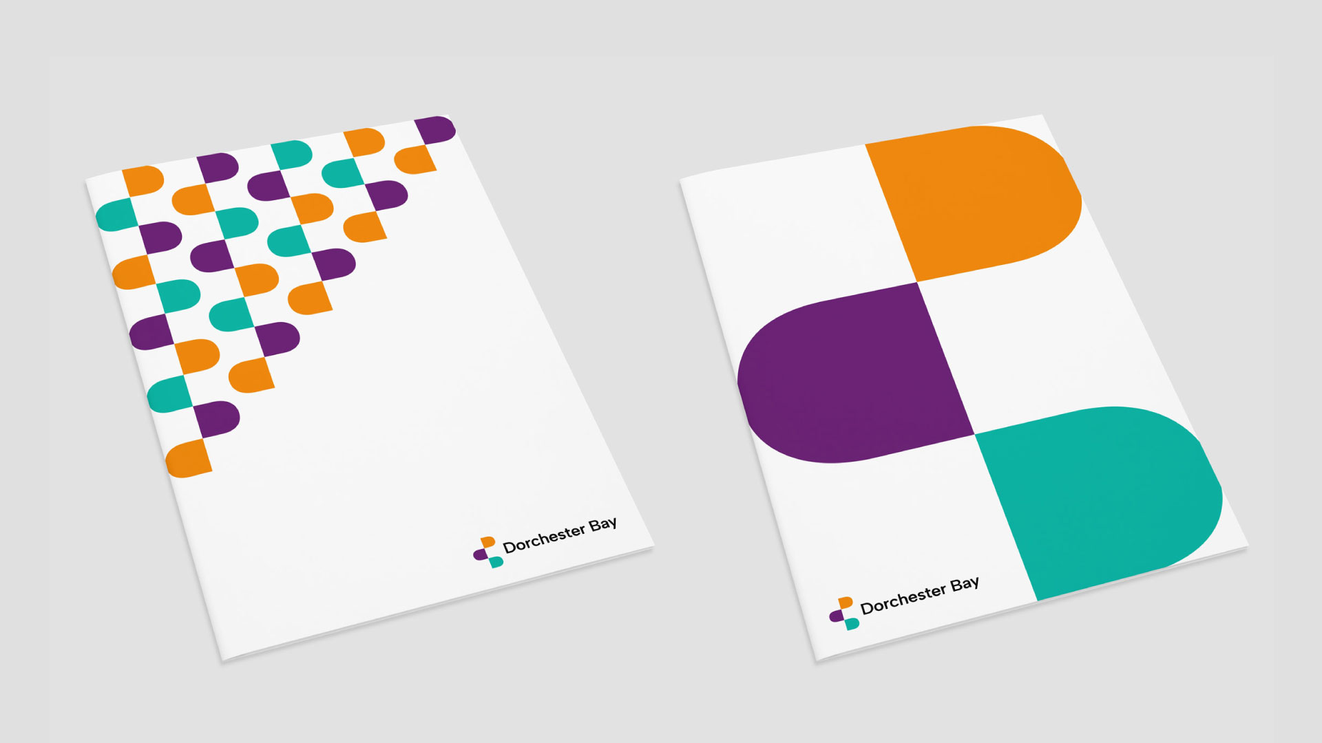
The new Dorchester Bay logo is an abstract composition made up of forms from the letters D and B. The stacking of these forms suggests growth and adaptability, and the forms are used throughout the brand to convey different tones. Used minimally, they convey Dorchester Bay’s more serious side—that of good financial stewardship. Used more playfully, they convey that Dorchester Bay is an expressive, joyful community member. The alternating brand colors have special resonance. They are drawn from the flags of countries that Dorchester residents immigrated from. These colors welcome people in.
Our research showed that very few people called the organization “Dorchester Bay Economic Development Corporation”. Despite the full name being in their logo, the majority of people simply referred to them as “Dorchester Bay”. Though it remains in their official name, “Economic Development Corporation” takes a backseat in the new brand, only appearing in the secondary logo. Presenting themselves with a leaner, more recognizable name, Dorchester Bay looks more neighborly than ever.
