At the nexus of the world’s leading biotech hub sits MassBio, whose explosive growth parallels that of the industry. With expanded programs, products, reach, and impact, MassBio plays a critical role in advancing Massachusetts’ leadership in the life sciences. Every day they are evolving the industry, adding value to the healthcare system, and improving patient lives. Yet their brand identity had been trailing far behind their organizational growth. To align the identity with their goals and ambitions, it was critical that they bring it forward in a bold way.
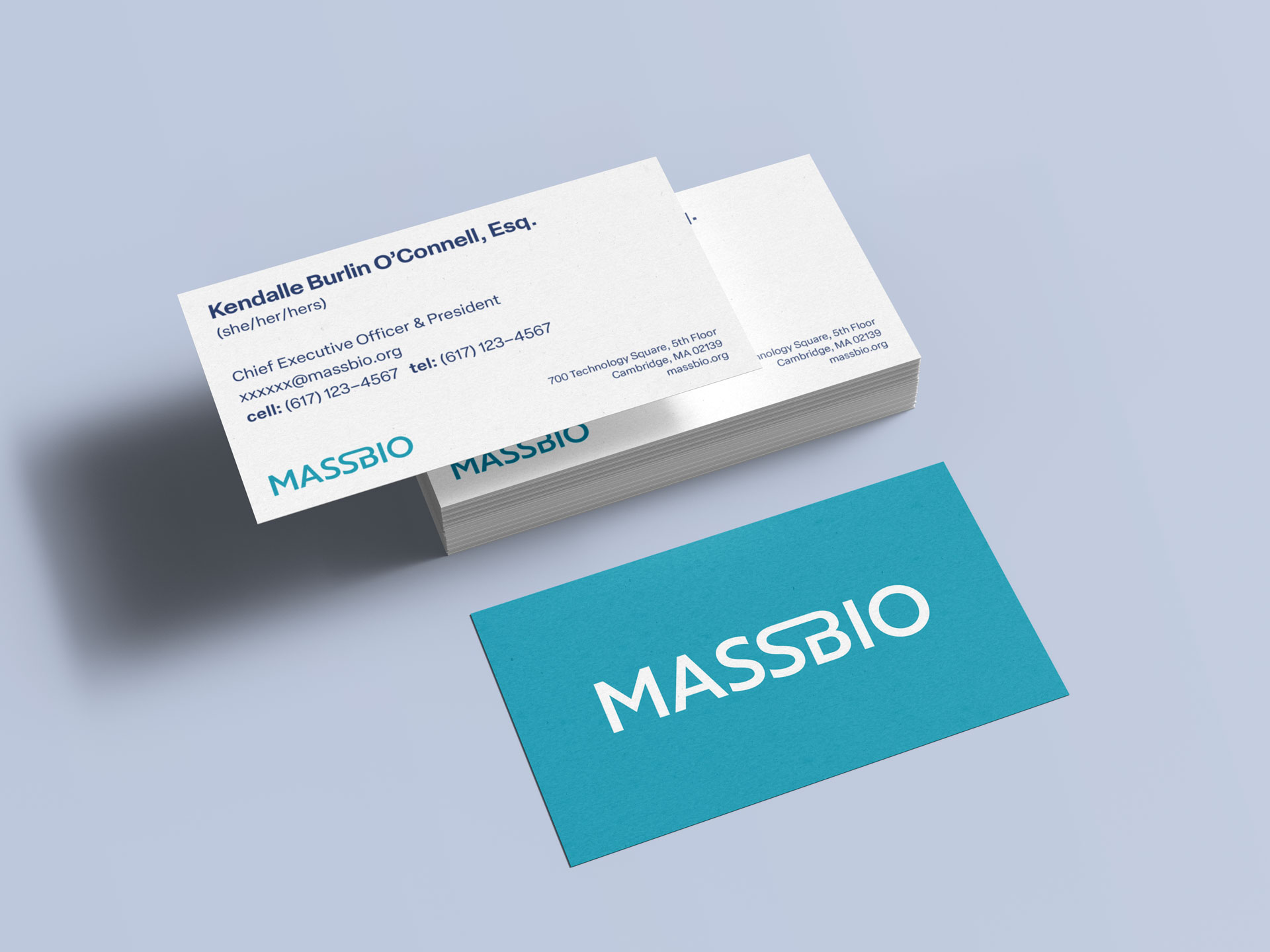
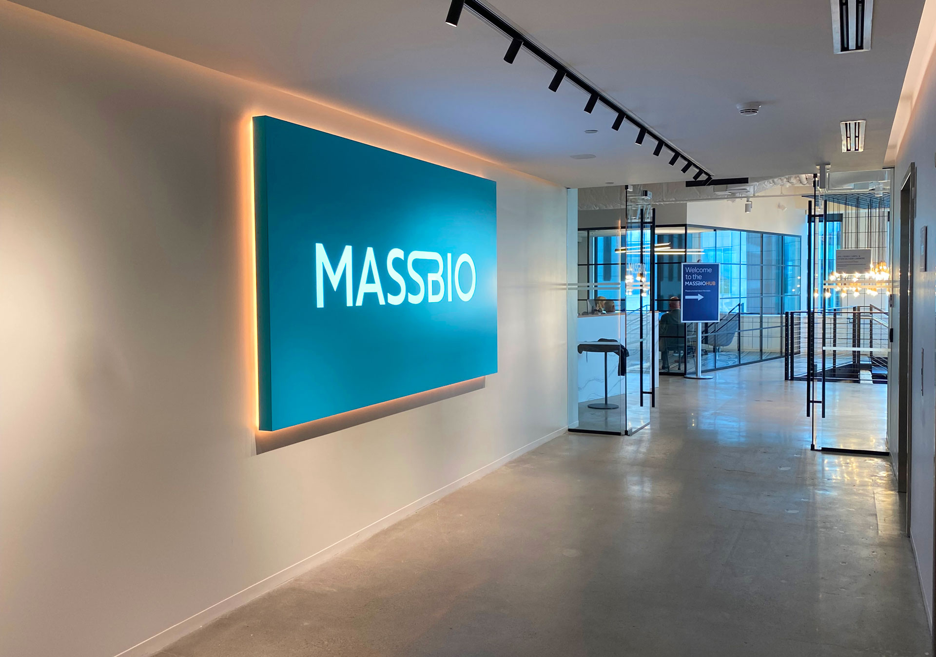
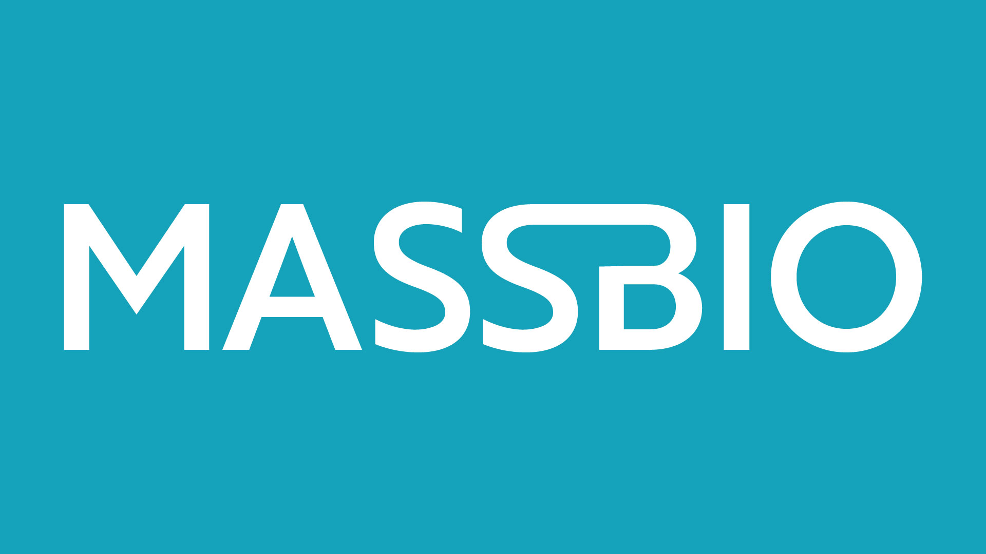
The new identity we built for MassBio is modern, simple, and dynamic. The logo visually creates a fluid connection: MassBio is a bridge between the people, ideas, and companies that fuel the innovations that shape the industry. In form and color, the identity is bold and declarative.
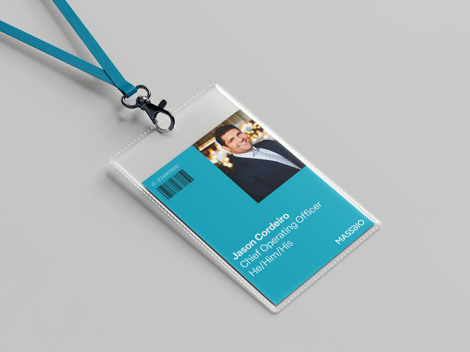
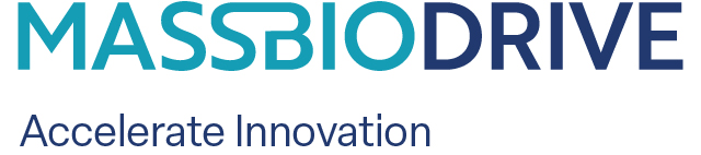
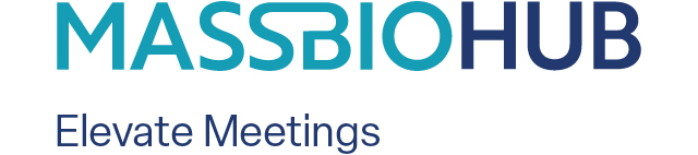
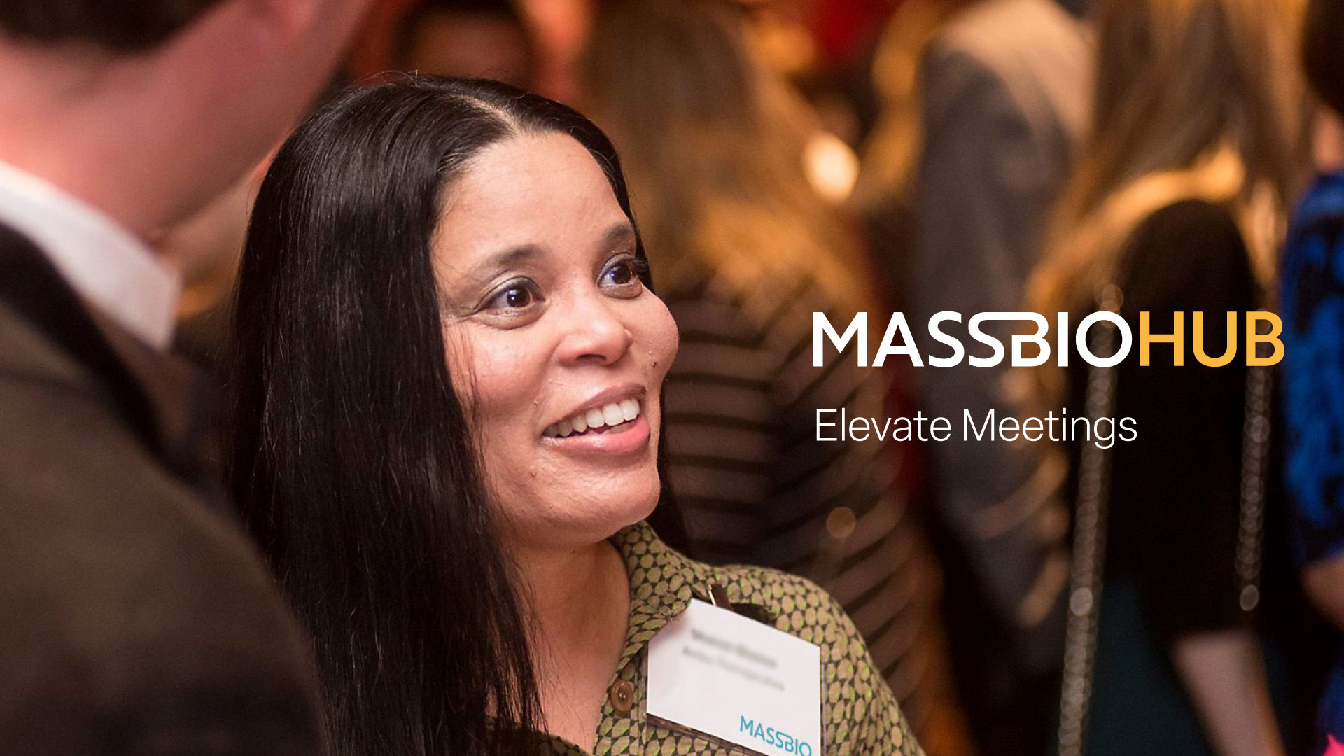
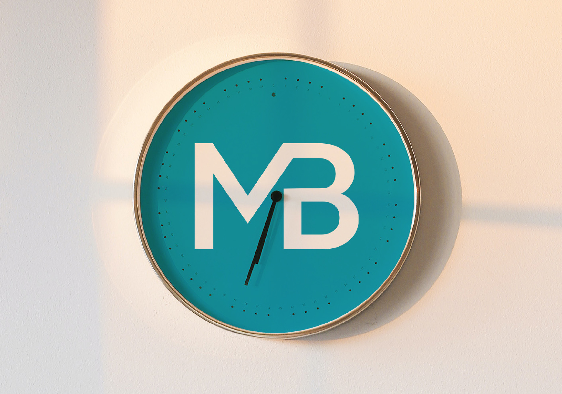
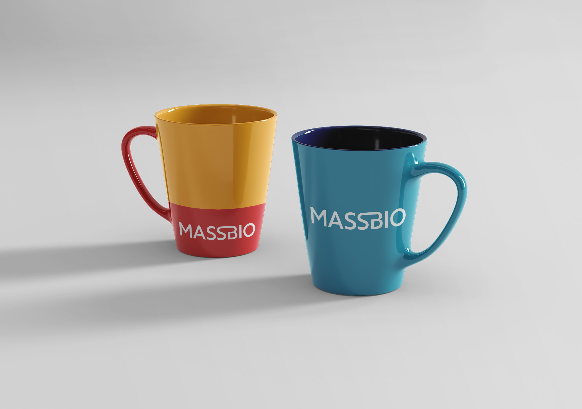
We developed a streamlined brand architecture that elegantly extends to MassBio’s sub-brands. For smaller spaces, such as social media, we designed a secondary ‘MB’ ligature that is equally representative and iconic. The new identity features a unique signature color, MassBio Blue, as well as a tasteful supporting palette—Navy, Red, and Yellow. Using these colors in fields behind typography and alongside imagery, MassBio is able to speak to its audiences more clearly and with greater vitality than ever before.
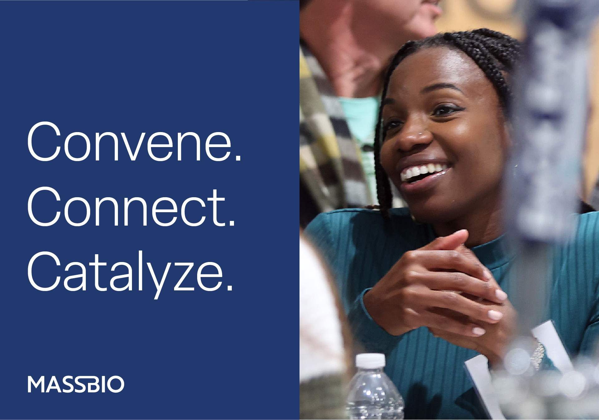
In addition to the identity, we devised several evocative support lines for MassBio and its sub-brands. Convene. Connect. Catalyze. is a clear summation of the processes MassBio supports. The three sub-brand support lines—Elevate Meetings, Accelerate Innovation, and Empowered Purchasing—each provide important qualifying statements with very few words. They help define and differentiate the roles that the sub-brands play in bringing value to MassBio’s members.