It isn’t often that a firm has the opportunity to rebrand one of the country’s most iconic identities—one so intertwined with our cultural fabric. Minelli had that rare opportunity in working with GBH to position them for continued growth and success in our rapidly changing media environment.
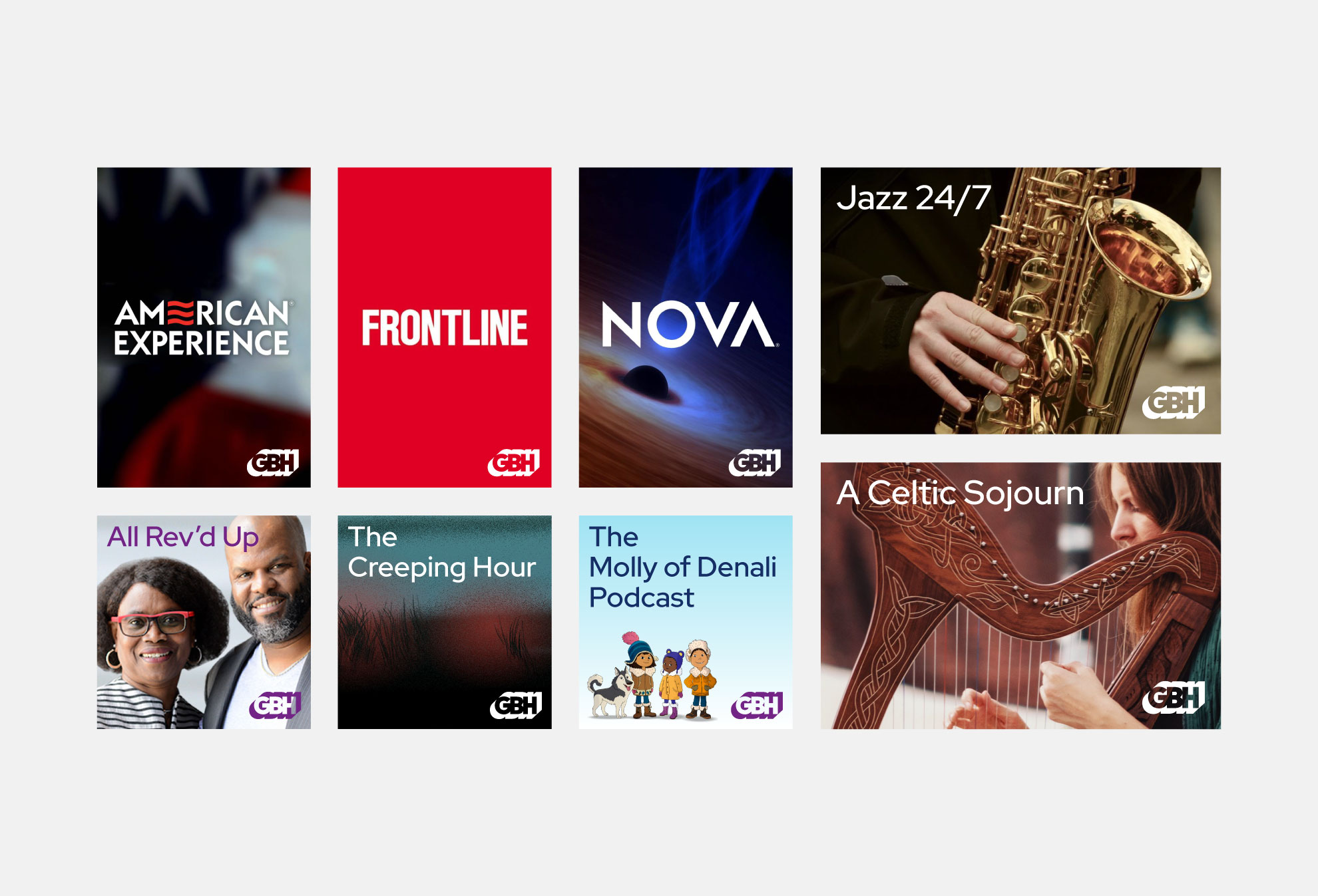
(W)GBH was founded in 1955 and pioneered much of what we have come to love about public media. They are the largest content creator for PBS. Their previous identity was designed by Chermayeff & Geismar in the early 1970s, when only a few channels were broadcasting content at designated times. We are now living in a very different world. In the streaming era, we consume content when, where, and how we choose. Currently, more than 50% of the organization’s impressions already occur on a digital platform. GBH needed a fresh identity to face this moment.
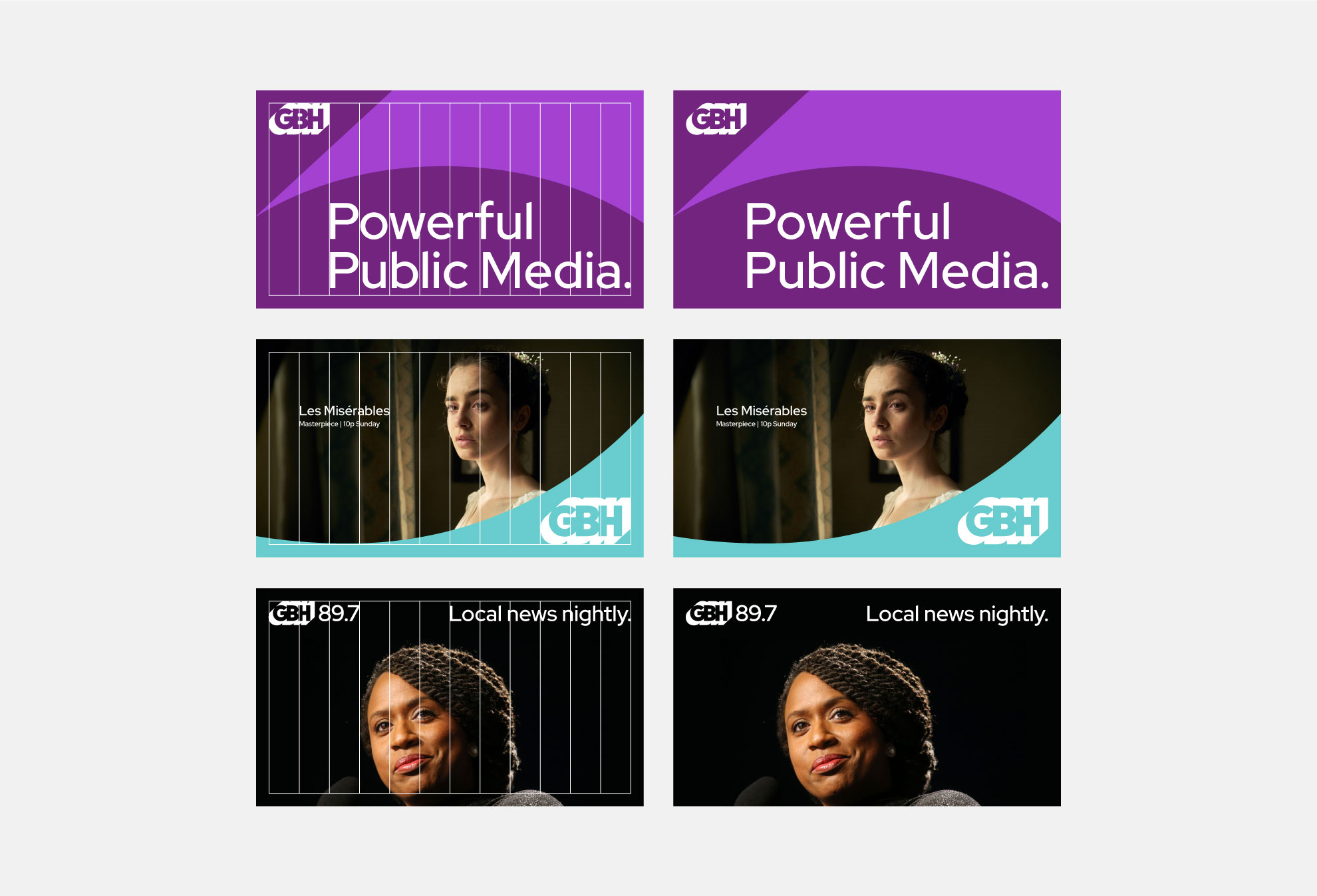
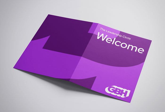
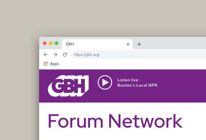
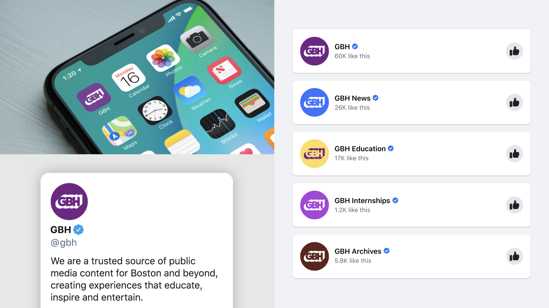
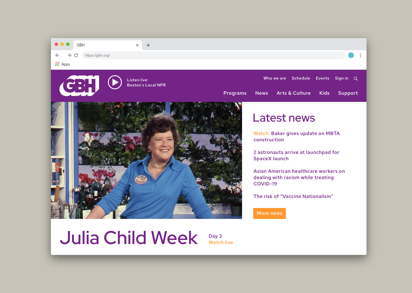
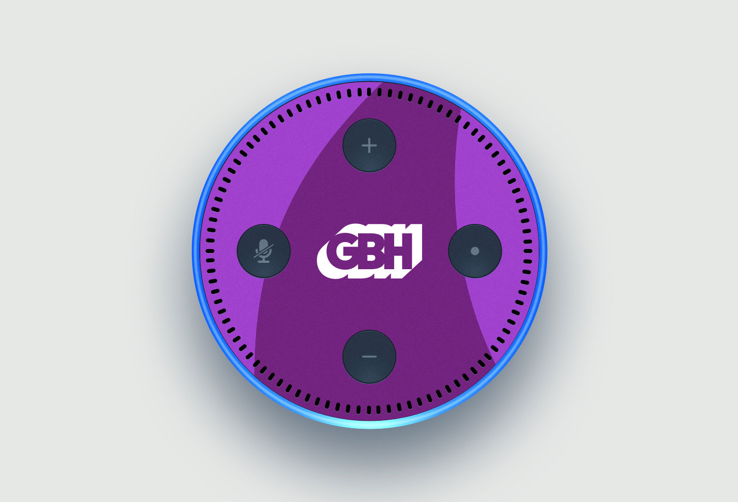
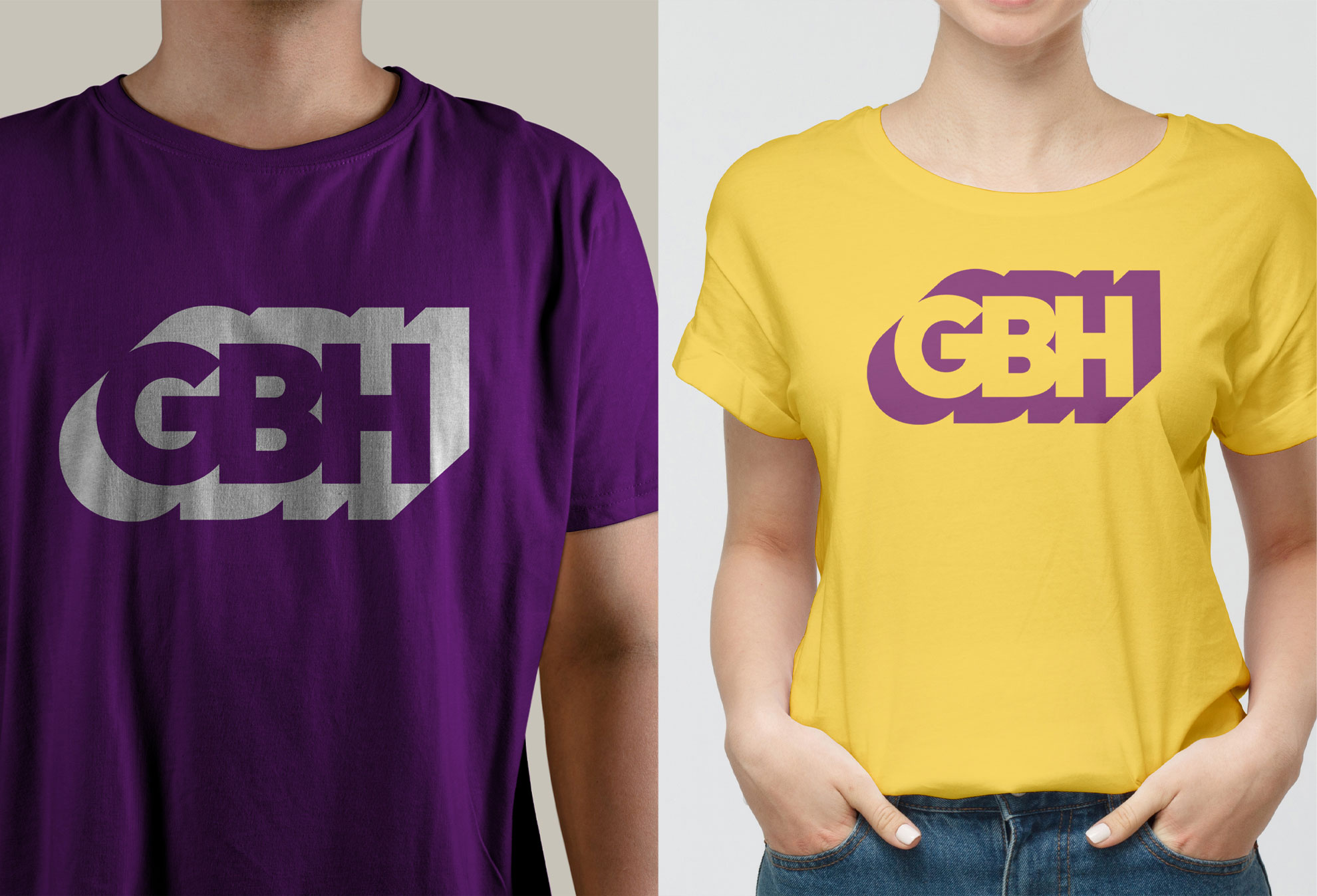
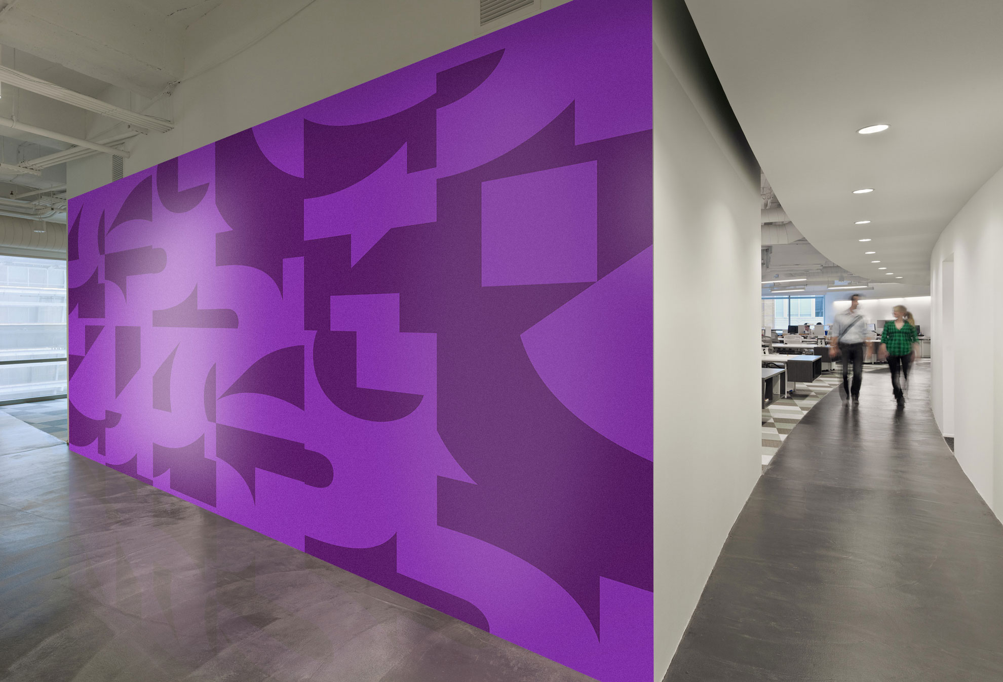
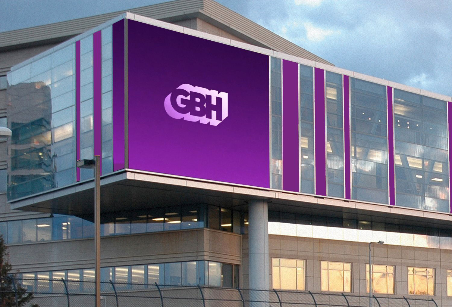
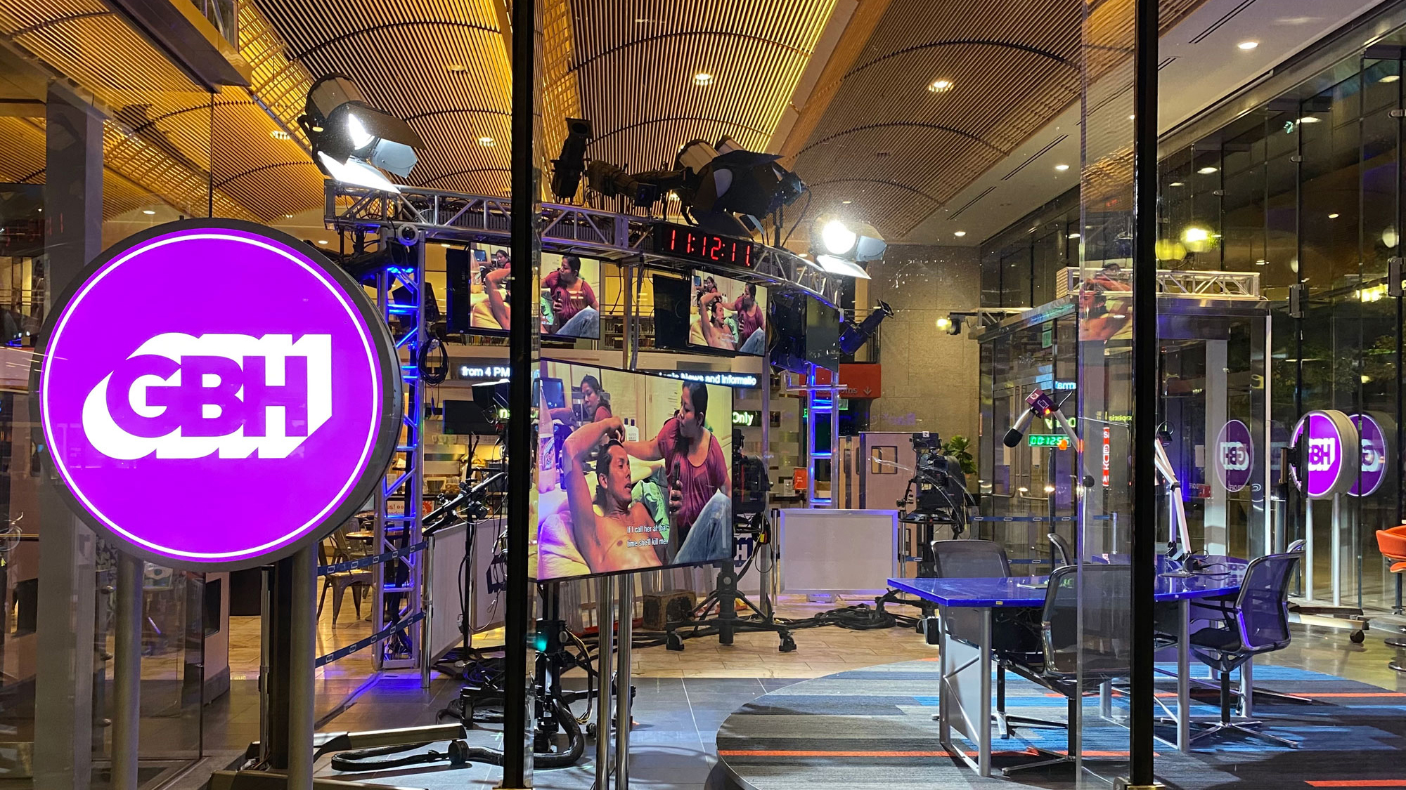
We discovered that the W in WGBH was a vestige of a bygone era. It defined a geographic area—stations east of the Mississippi got a W, west a K. By eliminating the W, we shed 3 syllables and allowed the new mark to become less horizontal and more functional. The logo is now more legible at small sizes and on digital platforms. Our intent was to develop a new interpretation of the classic logo that would retain the spirit of the beloved identity but reflect it boldly forward. We kept the signature paradoxical drop shadow, but completely reshaped the letterforms to be more open, modern, and legible. From the logo, we extracted a series of distinctive croppings to be employed as compositional elements across communications. We changed the signature color to a rich purple and created a robust supporting palette.
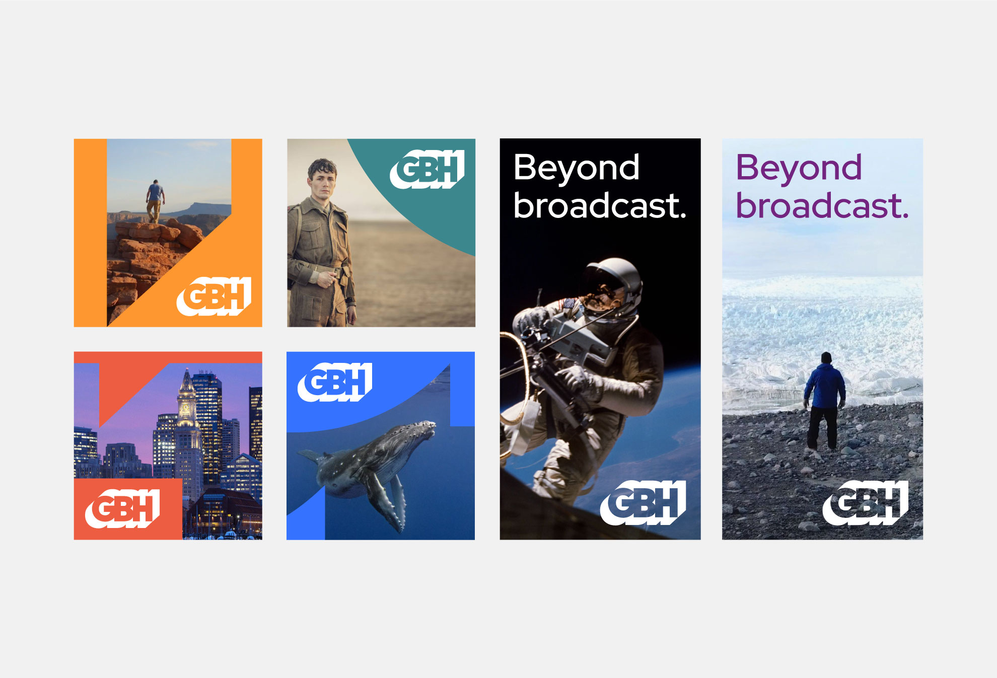
We also significantly changed GBH’s brand architecture. The architecture they had was cumbersome and inconsistent, a byproduct of the organization’s tremendous growth over the decades. We analyzed the full spectrum of existing conditions and developed a simple, elegant new architecture to be reflected in name, image, and structure. We codified this new architecture in a comprehensive brand standards manual, which details all aspects of GBH’s new strategy, messaging, logo, color, and image usage. The intent of the brand strategy was personified in a carefully orchestrated rollout campaign framed by the tagline “beyond broadcast”. The campaign set GBH’s flag into a future where innovative public media thrives and grows in reach and impact.
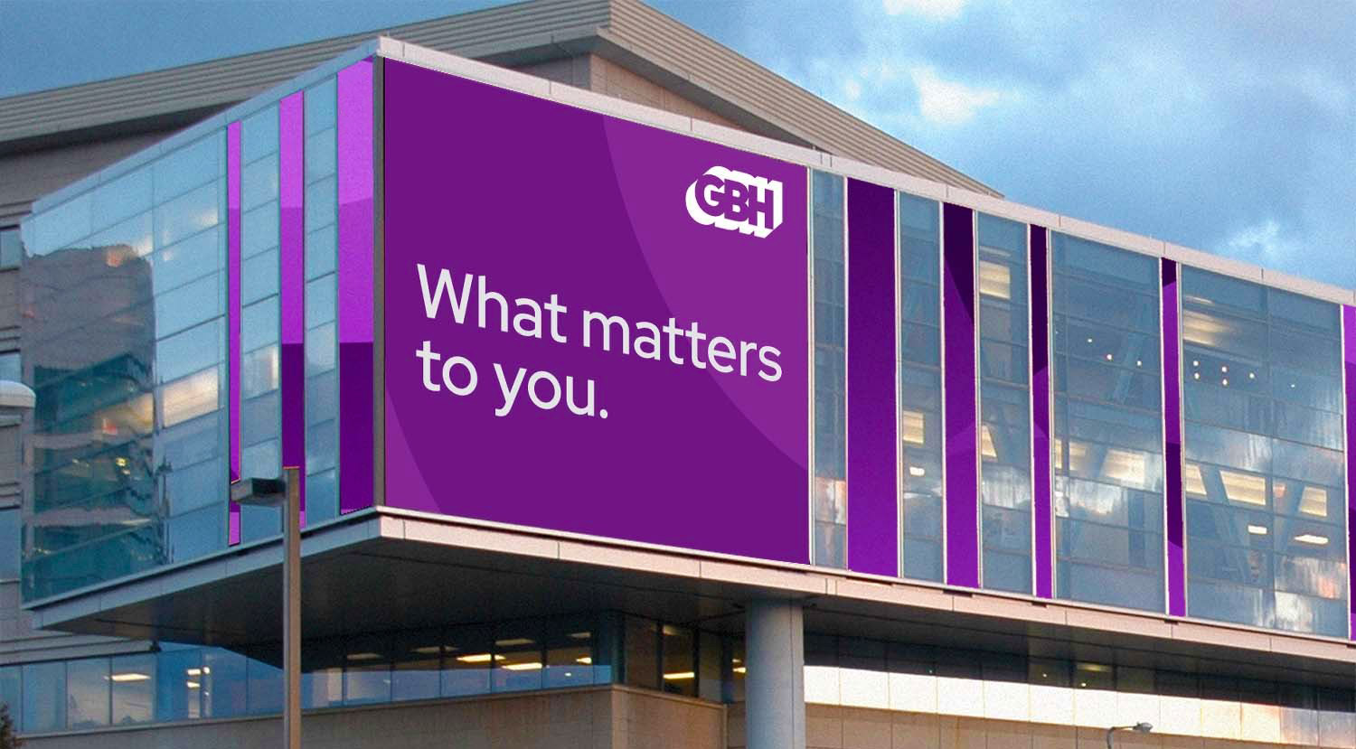
Once the new brand was established in the marketplace, we developed a new permanent institutional tagline—“What matters to you”—that rolled out the following year. To quote GBH President and CEO Jon Abbott: “This tagline is both a bold declaration that we center the audience in everything we do and a warm invitation for anyone to find a personal connection to GBH. Our audiences and our community are the reason for public media’s existence. They inspire us to carry it forward, to dive even deeper into our reporting, and fulfill our promise to enrich, inform, and entertain in ways that matter.”
Awards
• C2A Creative Communication Award for Branding and Identity Design, 2020
• GDUSA Award for Branding and Identity Design, 2020
![]()


Sting credit: Elias Mallette, GBH